Invvest aims to be a platform that meets the needs and expectations of the various investor profiles that exist while remaining simple and quick to use.
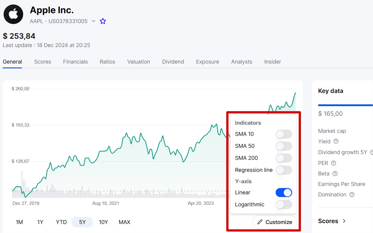
To achieve this, we have recently added two important and useful technical indicators to the price charts: moving averages and the regression line.
These indicators are available on all Stock, ETF, and Crypto pages (SCPI are not included) via the “Customize” button just below the chart.
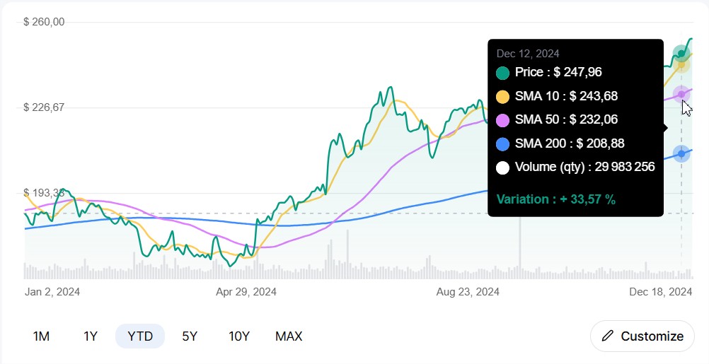
A moving average is the average of prices over a given period, which shifts day by day by taking into account the most recent data. This helps to better visualize the overall trend of an asset without being distracted by daily fluctuations.
There are several types of MAs (moving averages), but we have chosen the simple one (SMA). It is an arithmetic average of prices over a given period. Example: A 5-day SMA adds the closing prices of the last 5 days and then divides by 5.
We have added three moving averages: 10 days, 50 days, and 200 days.
Trend detection
If the price is above the moving average, the trend is bullish.
If the price is below, the trend is bearish.
Buy/Sell signals
Moving average crossover: When a short moving average (e.g., 20 days) crosses a long moving average (e.g., 50 days) upwards = Buy signal. The reverse = Sell signal.
Crossover with price: If the price crosses the moving average upwards = Bullish signal.
Dynamic support and resistance
Moving averages often act as support or resistance zones.
In general, moving averages simplify price analysis and help identify trends, entry, or exit points in the market.
The regression line is a statistical tool that represents a trend in a scatter plot by drawing an "ideal" line that best summarizes the relationship between two variables (often time and price).
In the stock market, it is used to model price variations over a given period and visualize the overall trend.
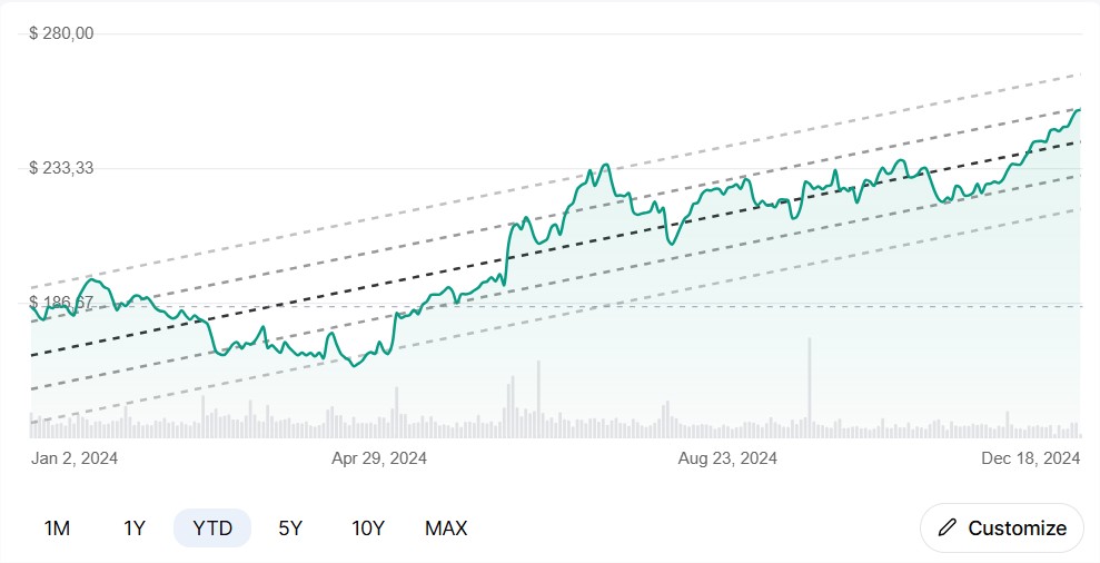
Analyzing the scatter plot: Each point represents the price of an asset at a given moment.
Calculating the line: The regression line is drawn in such a way as to minimize the distance between each point in the scatter plot and the line itself. This is called the least squares method.
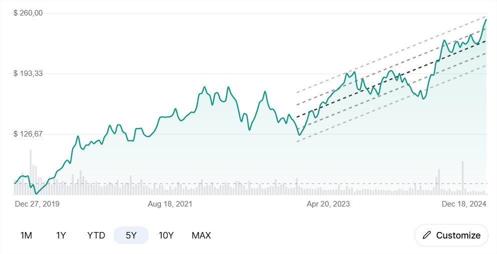
By default, the regression line is calculated from the first point of the selected chart period.
But it is entirely possible to customize the starting date of the line through the “Customize” menu. In the example below, the stock price history spans 5 years, but I requested that the line only start from 2 years ago.
Trend detection
If the slope is positive, the trend is upward.
If it is negative, the trend is downward.
Evaluation of current performance
If the current price is above the line, the asset might be overvalued.
If it is below, it might be undervalued.
Forecasting
Although imperfect, the line can help estimate where the price might head if the current trend continues.
Reversion to the mean
The regression line is sometimes seen as a "dynamic average" to which the price eventually returns (like a rubber band).