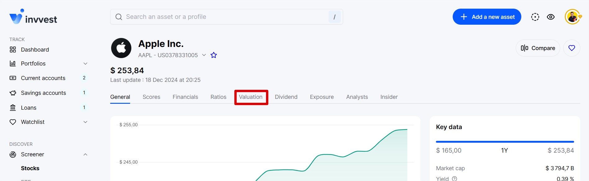
On all action sheets, in the “Valuation” section. It’s the very first chart.
The valuation chart answers a simple question: is a stock overvalued, undervalued, or fairly valued?
The idea is to help you analyze the valuation of a stock so you no longer overpay and can optimize your entry, reinforcement, or exit points.
Beyond the valuation at the current moment, the chart shows you the past evolution (last 5 years) of the theoretical fair price/stock price pair as well as the 2-year projection of the theoretical fair price.
As mentioned earlier, our algorithm calculates 3 groups of theoretical fair prices.
The historical fair prices
The current fair price
The estimated fair prices for the next 2 years
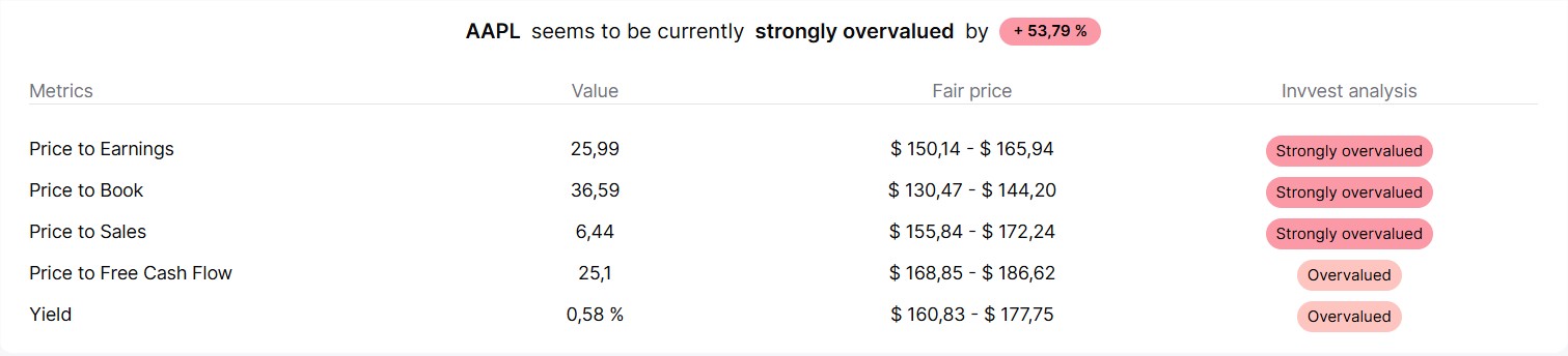
For the first group, our analysis is based on various indicators, primarily:
the historical P/E ratio (price-to-earnings ratio)
the historical P/B ratio (price-to-book ratio)
the historical P/S ratio (price-to-sales ratio)
the historical P/FCF (price-to-cash-flow) ratio
the historical dividend yield
For each indicator, we calculate its historical average. For example, Apple’s average P/E over the last 5 years is 26. Its average P/B over the last 5 years is 37, etc.
Thus, we are able to determine for each indicator what the fair price of the stock would be based on that indicator alone (with a P/E of 26, Apple’s theoretical fair price should be around $160).
Once we have a theoretical fair price for each indicator, we calculate an average with coefficients to determine the final fair price for a year.
To calculate the current fair price, we do the same but add the TTM indicators (that is, those of the last 12 rolling months) to the average.
And to calculate the estimated fair prices, we do the same again but project a growth percentage for each indicator based on an average of past growth.
These details are quickly presented just below the chart.
This may seem complex, but our valuation chart is designed to save you a lot of time by simplifying everything.
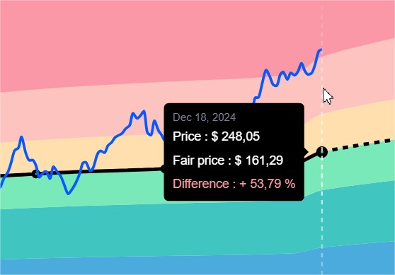
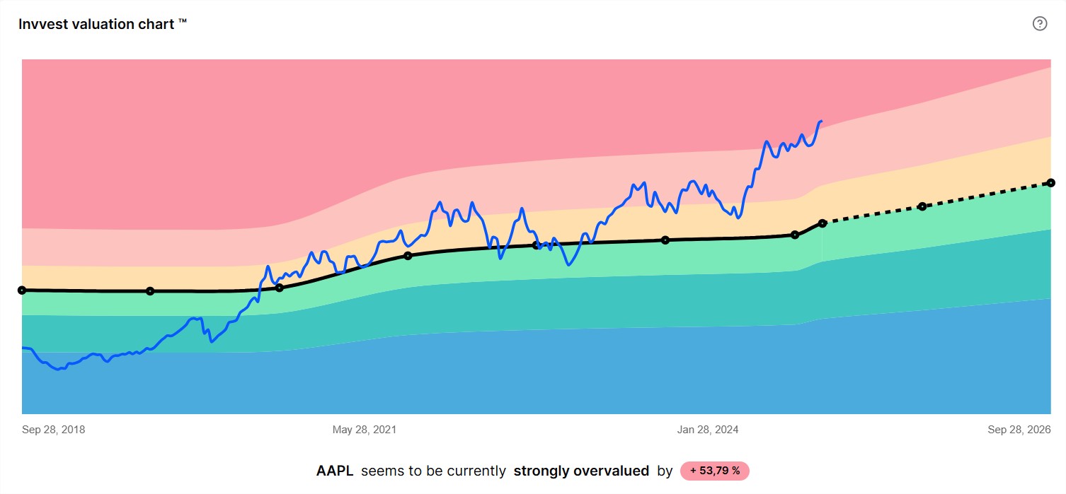
The blue line represents the actual stock price over the period.
Meanwhile, the black line represents the theoretical fair price. Around this line, we display colored bands representing degrees of valuation.
Yellow and light green: around the fair price
Light pink: overvalued
Dark pink: significantly overvalued
Dark green: undervalued
Blue: significantly undervalued
In the example below, we can see that Apple stock is currently in the red zone, meaning a period of significant overvaluation. It was around its fair price between 2020 and 2022 and was undervalued in 2018/2019.
It is, of course, possible to hover your mouse (or tap on mobile) over any point on the chart to display details in a tooltip.