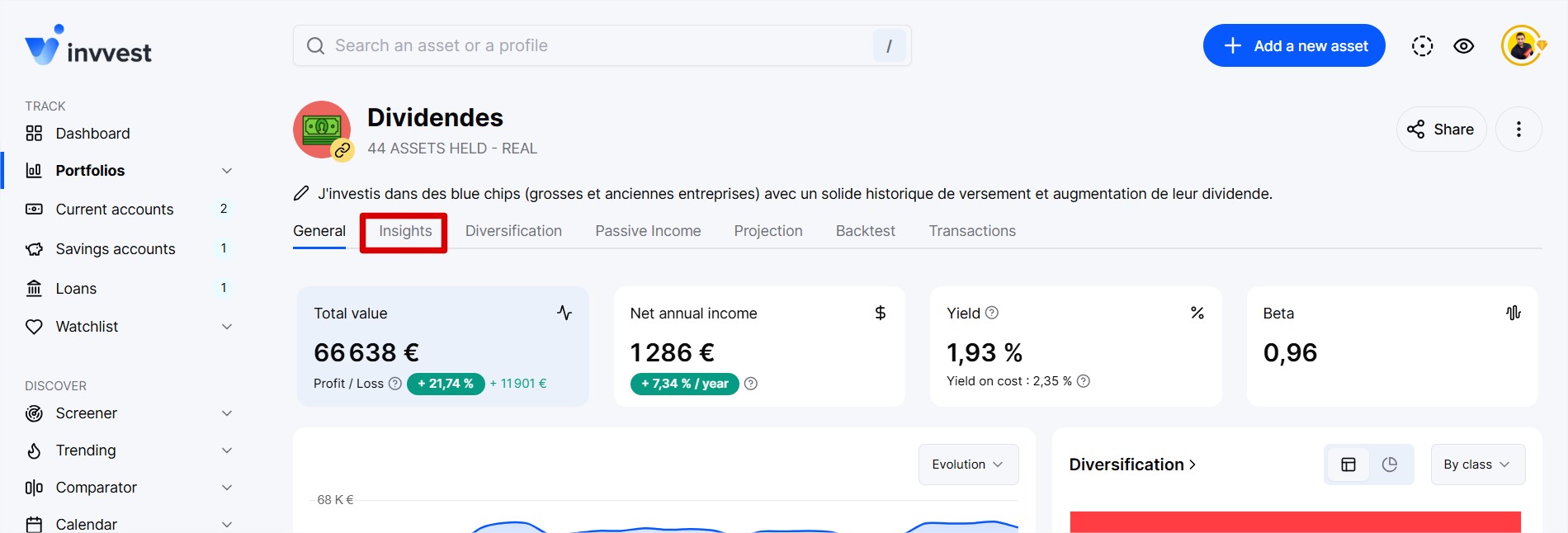
In your portfolios and watchlist, in the “Insights” section.
To understand the idea of the Valuation Spectrum, it’s important to know that for each stock, our algorithm calculates its theoretical fair price and determines whether a stock is overvalued, around its fair price, or undervalued.
Learn more:
Mastering the Valuation Chart
Learn more about our way of estimating the fair price of a stock
But let’s get back to the Spectrum.
This chart allows you to see at a glance all the valuations of the stocks held within a portfolio/watchlist.
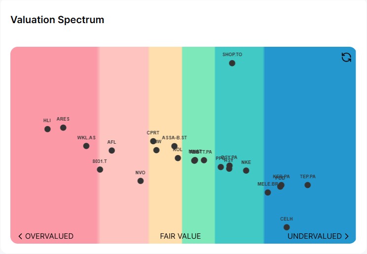
All your stocks are spread across the spectrum, giving you an immediate view of each stock’s valuation without leaving the page. The further to the left (in dark pink), the more overvalued it is, and the further to the right (blue), the more undervalued it is.
We have also integrated a vertical dispersion representing the weight of the stock within your portfolio. The higher it is, the more this stock weighs in your portfolio. The lower it is, the less it weighs. It’s the perfect combo to know what to strengthen and what not to strengthen.
In the spectrum of the Stock watchlist, the vertical dispersion represents the difference between the stock price and its 200-day moving average.
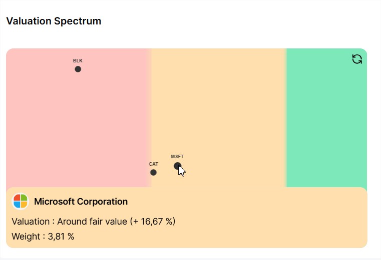
You can zoom in and move the spectrum with your cursor/finger and click on a stock to display a tooltip containing additional details, including the difference between the stock price and its theoretical fair value, as well as its weight within your portfolio.
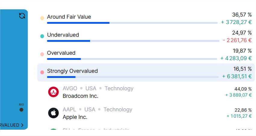
And finally, for portfolios, we also display your allocation grouped by valuation.