In your portfolios and watchlist, in the “Insights” section just below the Valuation Spectrum.
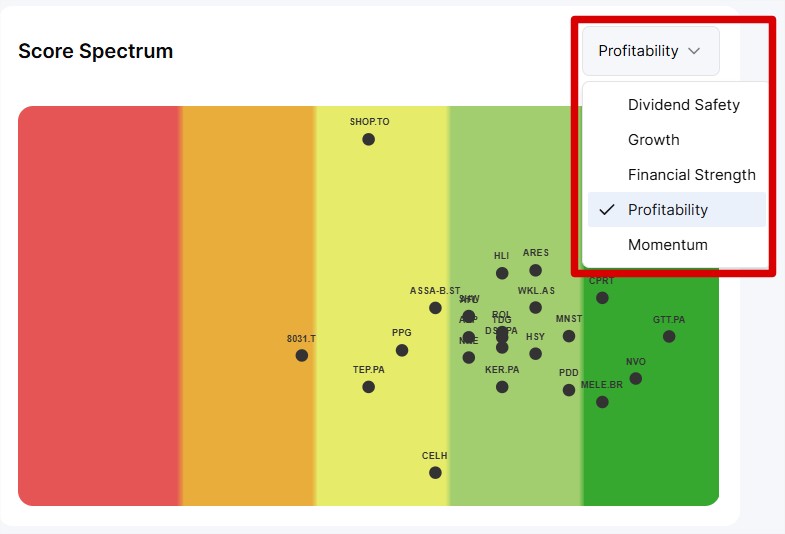
To understand the idea of the Score Spectrum, you need to know that we have created 5 algorithms that analyze dozens of criteria and indicators to give each stock 5 ratings that we call “Scores”.
The Scores:
of dividend safety
of growth
of financial strength
of profitability
of Momentum
Learn more:
Mastering Stock Scores
Learn more about dividend safety scores, growth, profitability, etc.
But let’s get back to the Spectrum.
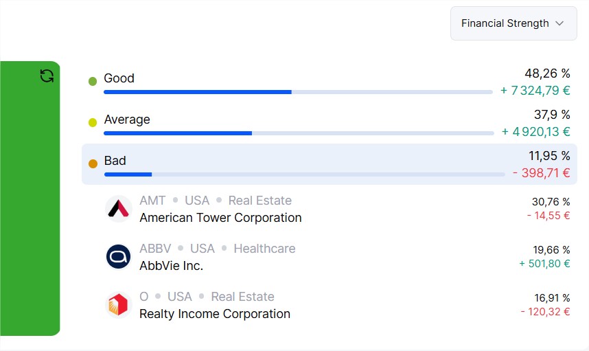
This chart allows you to see at a glance, for each score, all the ratings of the stocks held within a portfolio/watchlist.
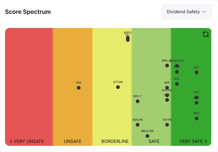
All your stocks are spread across the spectrum, giving you an immediate view without leaving the page of each stock’s score. The further to the left (in red), the worse the score, and the further to the right (dark green), the better the score.
We’ve also integrated a vertical dispersion representing the weight of the stock within your portfolio. The higher it is, the more this stock weighs in your portfolio. The lower it is, the less it weighs.
In the Stock Watchlist spectrum, the vertical dispersion represents the difference between the stock price and its 200-day moving average.
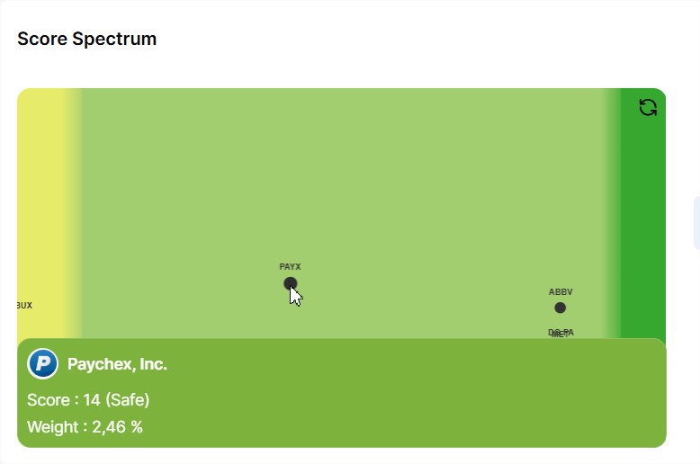
You can zoom and move the spectrum with your cursor/finger and click on a stock to display a tooltip containing additional details, including the difference between the stock price and its theoretical fair value, as well as its weight within your portfolio.
You can switch from one score to another via the dropdown menu in the top right corner.
And finally, on the portfolios, we also display your allocation grouped by rating.